Collingwood Lighting work experience

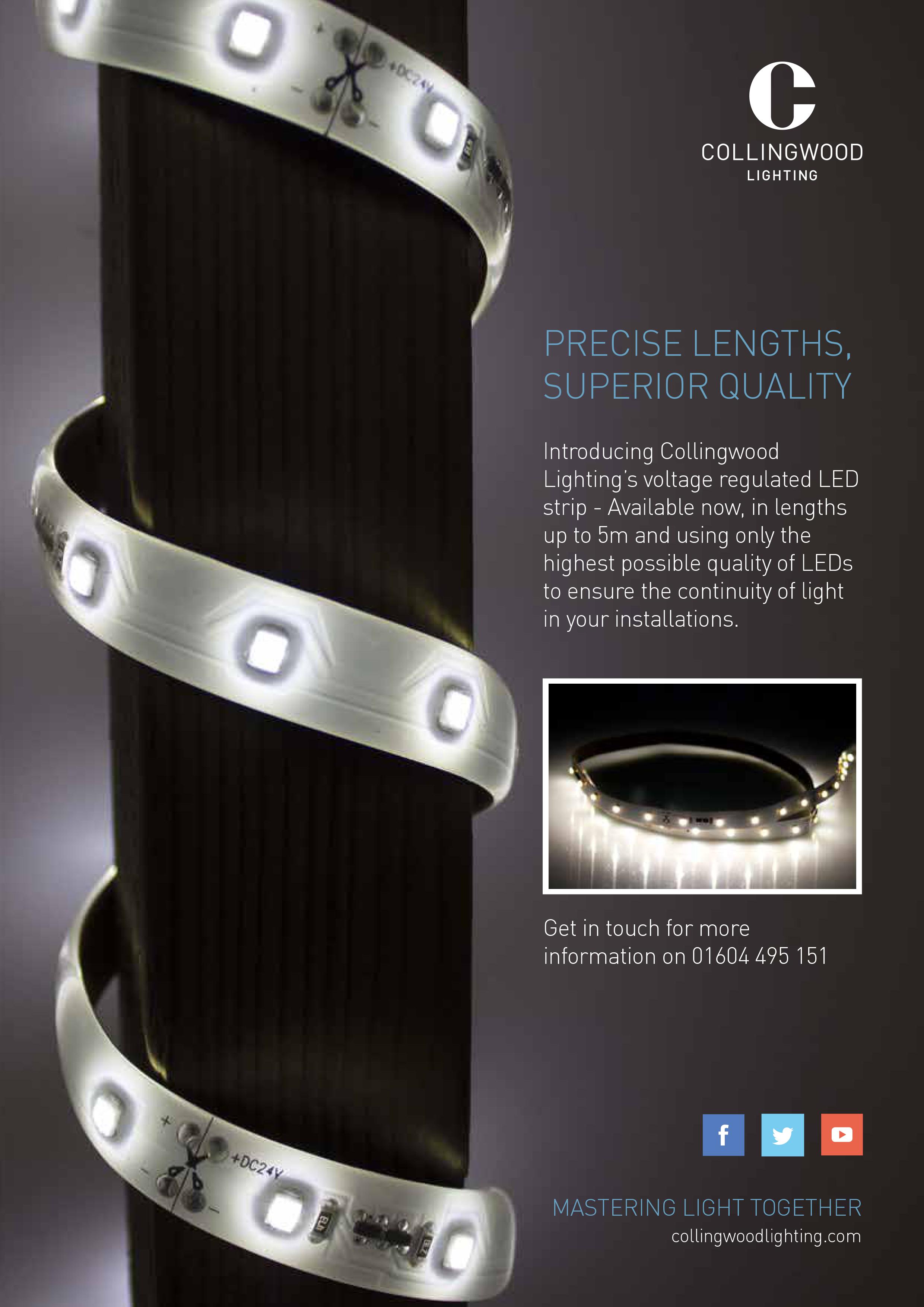
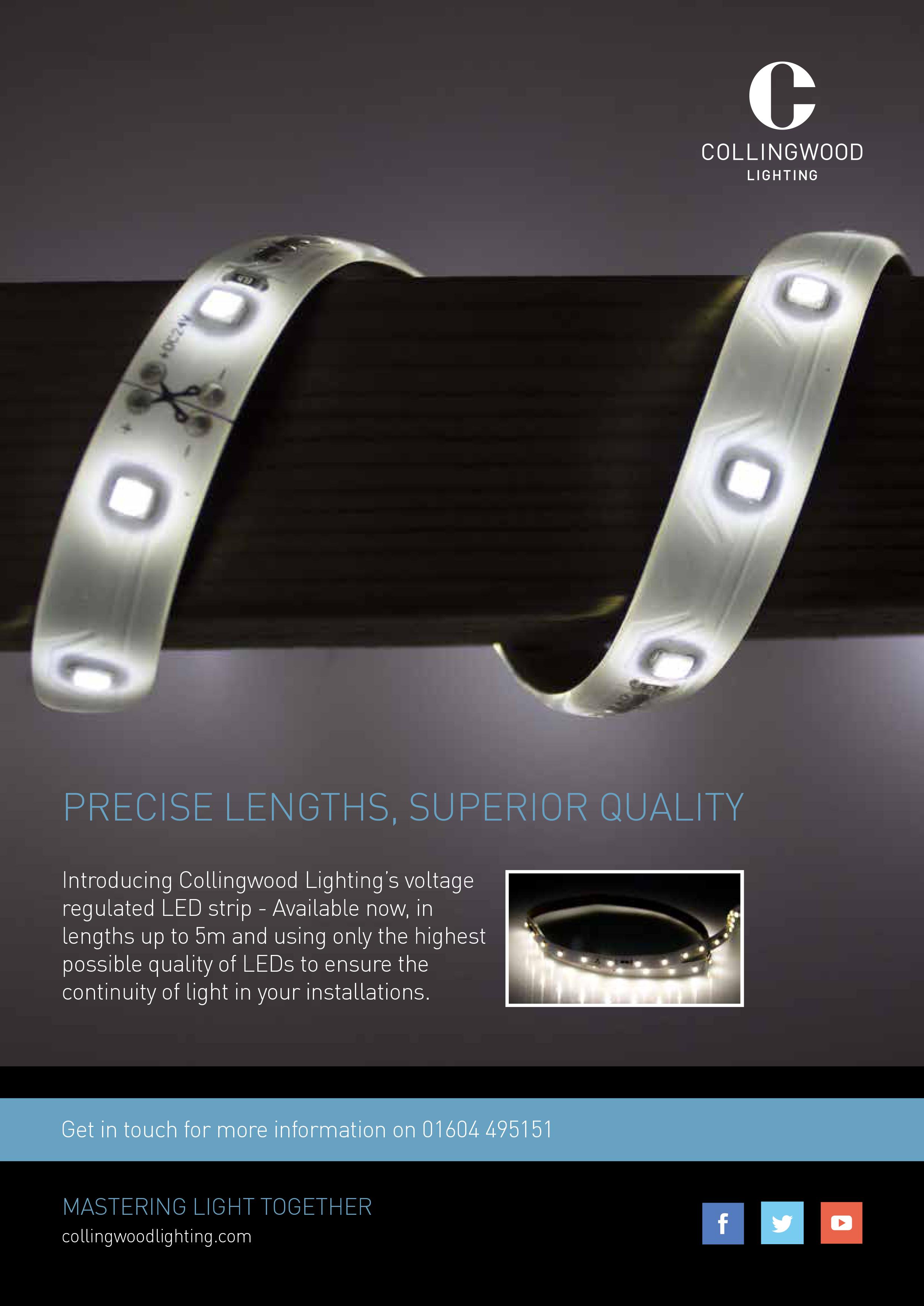
During November I spent 3 days with LED lighting manufacturer Collingwood Lighting, with their in-house design team. Below are two pieces of design work which I completed during the 3 days – one is a banner advertising their showroom and the other is an advert for their voltage regulated LED strip.

Collingwood Lighting
Advert A4
Collingwood Lighting
Advert A4
Collingwood Lighting
Pull up banner
Advertisement

Gone for lunch app

An app that temporarily disables the user’s electronic gadget, thereby forcing them to take a break. The user simply enters the length of time for their break and the app counts down.

Gone for lunch
App
Gone for lunch
App and email notification
Gone for lunch
App
Gone for lunch
Text message notification
Gone for lunch
Newspaper advert
Gone for lunch
Taxi advertising

The Good Stuff

The Good Stuff is a healthy eating company for young people that offers a healthy alternative to fast food chains and junk food. The idea behind the black and white colour scheme was to break the mould of healthy eating being associated with the colour green and to stand out from the crowd. It was also to make healthy eating more appealing and cool, enabling the brand to reach out to a young audience. At the heart of the brand is the typography which appears on the food truck and food packaging. The style I have used for the text is young and quirky and makes the subject of healthy eating more fun and interesting. The fact that the food truck is portable means it can travel around to university campuses or town centres and spread the healthy eating campaign.

The Good Stuff
Sandwich packaging
The Good Stuff
Rolls Packaging
The Good Stuff
Bap packaging
The Good Stuff
Drinks bottles
The Good Stuff
Baguette packaging
The Good Stuff
Food packaging
The Good Stuff
Food truck
The Good Stuff
Bag
The Good Stuff
Stamp
The Good Stuff
Website
The Good Stuff
Facebook page

LH/ RH comic

A typographic project looking at changing the existing comic sans typeface in order to make it more usable. My idea looked at having both a left and right handed version of the typeface, resulting in LH comic and RH comic. The project also asked to include the new typeface in either a type specimen poster or booklet, and I chose the latter. As my typeface has two versions, I decided to make two booklets, but joined them together with one opening at the front and the other at the back.

Comic sans hand drawn
LH comic type specimen
Comic sans hand drawn
RH comic type specimen
Comic sans hand drawn
LH comic type specimen
Comic sans hand drawn
RH comic type specimen
Comic sans hand drawn
LH comic type specimen
Comic sans hand drawn
LH comic type specimen